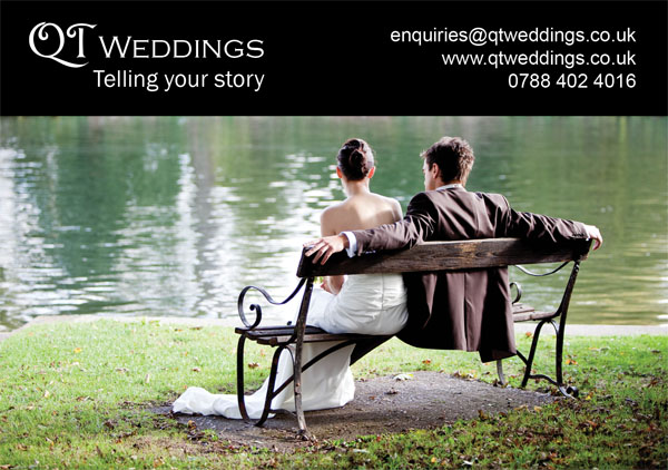
Had a great advertising offer through from Dream Wedding Fairs on Tuesday evening. They had found me through the directory on the SWPP website and although I don’t normally even read unsolicited email I thought I’d persue this one. Needless to say the offer meant me designing a new advertisement to place with them and here is the final result.
I like it – simple, elegant, gets the message across and is consistent with the look and feel of all my marketing material. I chose the image based on the instant feedback I’ve received when handing out my business cards. This is the one that most of my female clients select.
It isn’t just about me though. If anyone would like to critique this layout, please let me know. I’m interested to know…
- What you like about it
- What you don’t like about it
- What you would have done differently

BTW – The image represented here is smaller than the final, printed copy which will be approx. 1/2 A5


Yes, I do know I was suckered into this, but at the prices they are charging me I would be foolish not to.