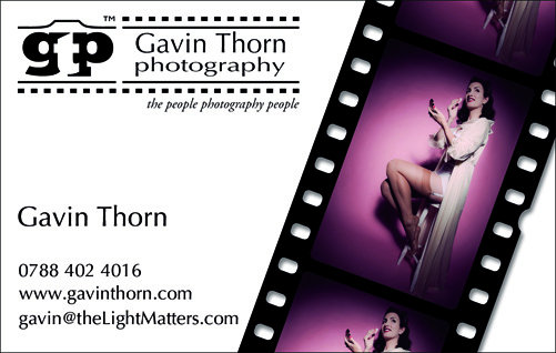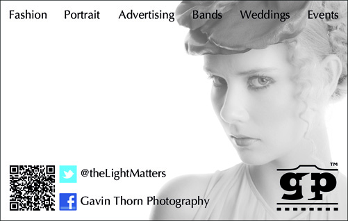
Firstly a huge thanks to everyone for all the great feedback I received via Twitter on the design of my new business cards. As you can see, I’ve made a few changes here and there. It’s only very subtle but that’s often the way with graphic design. I’ve also managed to meet all my design requirements too, namely:
- incorporate my new branding and logo
- clean design with no clutter
- high visual impact
- interchangeable images
- QR code
- service offerings
- social media touch points
- space to write on the back
- make it look like a photographer’s card

The QR code presented an interesting design issue. It’s a very ugly component to put on a soft card! It’s high black density makes it a dominant component that distracts the eye and it needs to be large enough to scan. If it can’t be read the whole design fails. To overcome this dominance I added more weight on the other side for balance in the form of my new logo and included a beauty shot of a very pretty model, Kamila, placing her eyes on a power node. This in turn became a very dominant element on the back of the card, completely smothering everything else hence the reduced opacity and desaturation. The only thing I don’t like about the card is all the negative space on the left. I wanted somewhere that could be written on but it would be better for a right handed person if it were on the other side. I’ve tried flipping the card around but it simple doesnt feel right that way.
I’m happy with the design now and although I still like my current card, this one feels like a huge step forwards. Its not dark, edgy or moody. Its bright and fun. Its clean and snappy. Most of all, its versatile. Now all I need do is determine how many varieties to order and which images I to use on the finals for the front and back.


