The more observant amongst you will have noticed a new addition to theLightMatters blog, up there in the top left corner of the page, my new logo. It’s only taken me 4 years to design it and with the redesign of the site, it’s a necessary element to include.
When embarking on this new design I wanted to avoid all the cliché photography logos – those with cameras, bits of cameras, negatives etc. I wanted something that was much more akin to the fundamentals of photography. I wanted something to highlight what I perceive to be the most important aspect of photography: light and shadow. That’s what I wanted my logo to be about and hopefully I’ve achieved it.
Very early on in my photography training I realised how important the control and manipulation of light was to the success of an image. That’s why I chose the name theLightMatters for this blog but I’ve always struggled when trying to devise a logo to complement it. Having tried many, many ideas and designs over the years and never coming up with anything I really liked, I put the project on hold. Last week I re-read my logo design book, “Logo Design Love” by David Airey, I set about the task once more. I’m really glad I did too for this is the resulting design.
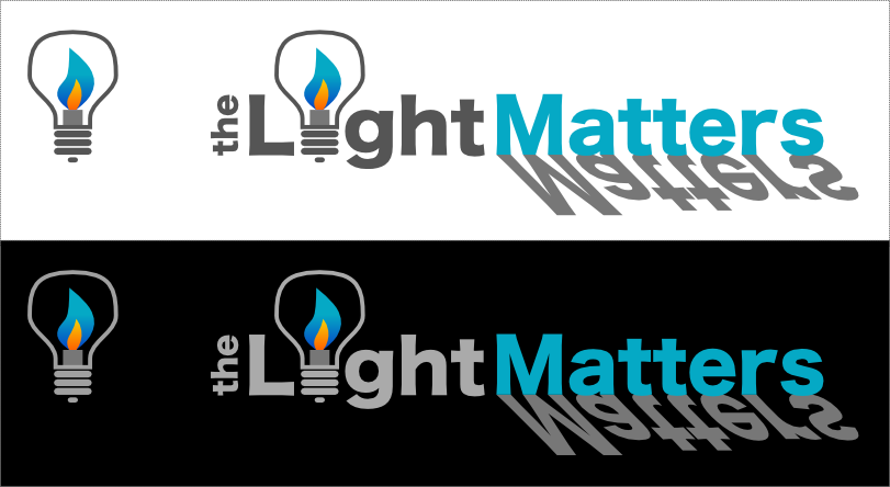
The design includes a very strong emphasis on light and shadow whilst also being complementary to the design and colour scheme I’ve used in this site.
My design constraints were simple. It had to be clean and simple with a contemporary look. I wanted a single graphical element that would also stand on it’s own. As I said above, I needed something that would fit with the DNA of this website whilst also being suitable for use elsewhere such as printed media, stitching (hence the very limited use of shading).
I wanted to emphasise the concept of “light” and highlight how important I believe it is to making a successful image. Using a lightbulb in place of the ‘i’ was an obvious choice to make but the inclusion of the candle flame rather than a filament adds a poetic twist, drawn from my love of low light photography. With a strong graphical emphasis on the word ‘Light’ I chose an alternative for the word ‘Matters’ as can be seen. The use of the colour highlight and the pseudo-shadow balances the weight of the word ‘Light’ whilst still adding the emphasis I desired.
So there you have it. My new logo design 🙂
I’d love to hear your thoughts on what I’ve come up with so please leave a comment below.