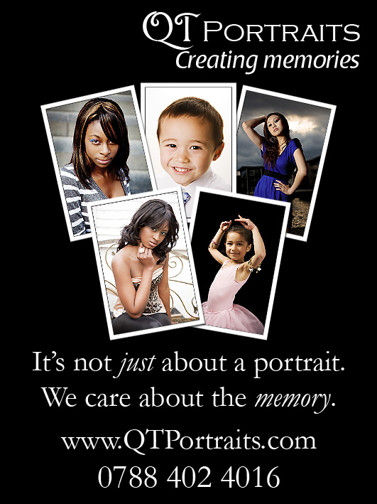
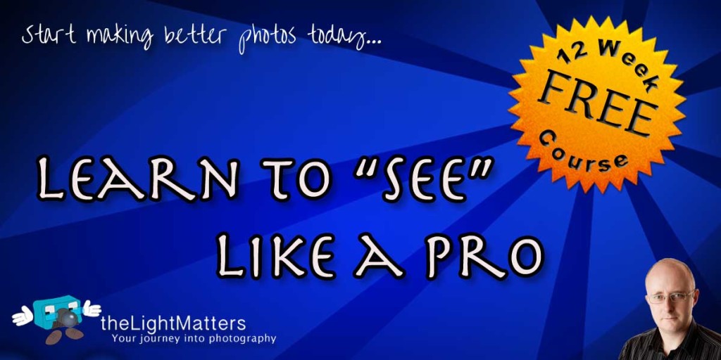
Just finished the artwork for my first real advertising campaign. Not sure how it will ultimately turn out so any comments welcome.
This first one is the artwork for a local family magazine. I’m looking to place a small advert in the next edition that is due to be published in November. The artwork presented an interesting design challenge because at 1/16th of an A4 page, it is only 45mm wide by 60mm tall. Not much real estate to work with and ensure that the text is readable. The design itself is based on the larger 8×6 flyer artwork below. Unfortunately I had to drop my email address from the artwork in favour of the phone number.


