Just finished the artwork for my first real advertising campaign. Not sure how it will ultimately turn out so any comments welcome.
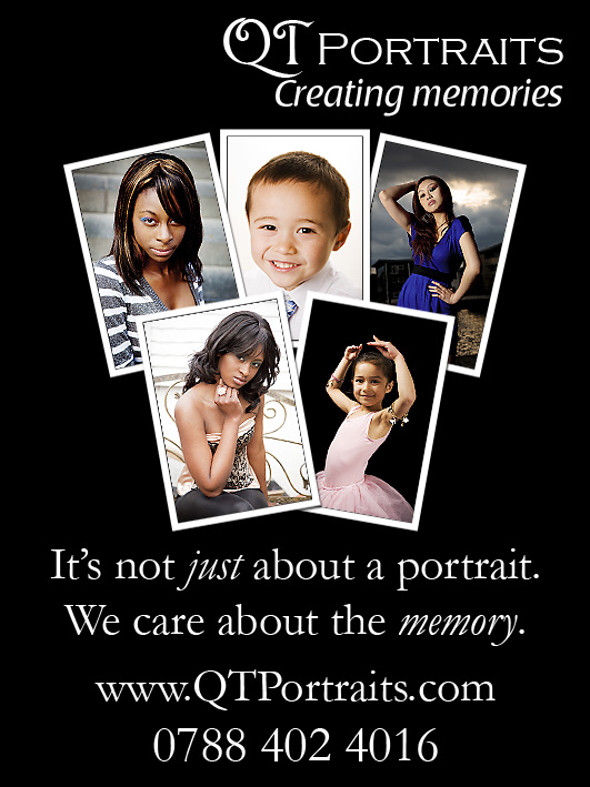
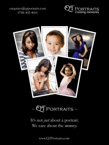
This first one is the artwork for a local family magazine. I’m looking to place a small advert in the next edition that is due to be published in November. The artwork presented an interesting design challenge because at 1/16th of an A4 page, it is only 45mm wide by 60mm tall. Not much real estate to work with and ensure that the text is readable. The design itself is based on the larger 8×6 flyer artwork below. Unfortunately I had to drop my email address from the artwork in favour of the phone number.

The next image is the artwork for advertising flyers that will be put on noticeboards etc. in the local area. I’ve had 50 of these printed, full size on 8×6 photo paper. Why? Because it is (so far) the cheapest way I’ve found to have low volume, gigh quality flyers made. Ordering from snapmad.com the price works out at 23p each for 50 off, with no P&P.
As for the design, I wanted something with impact, hence the black colour scheme. This also fits in very nicely with the website and my business cards. I also wanted the design to be quite minimal and uncluttered. I’ll probably take some criticism as all the services and prices are not included but I can assure you that this is intentional. If I put everything on the flyer, the prospect needn’t contact me for more information and I’ll lose out on a potential lead. Also, for a portrait photographer, the services are pretty standard. Lastly, and most importantly, I’m not trying to find the “now” buyer but rather to seed the mind of the prospect with the name QTPortraits. Why? Because the “now” buyers represent only a very small per centage of the overall market and they’ve very likely made up their minds who they’ll go with. The “future” buyer’s market is significantly larger.

It’s been great fun designing the artwork. I’ve also now written a second tag line that nestles in alongside the first: “It’s not just about a portrait. We care about the memory.”
Have fun,
Gavin


[…] gavin on Sep.20, 2009, under Marketing The proofs I ordered for my advertising artwork arrived a couple of days ago and to be honest I’m a little disappointed with the results. […]
Received my eagerly awaited copy of the “Family Grapevine” today. Couldn’t wait to search through it’s pages to find my advert. I was really pleased to find it featured on page 3. Not sure if it was because it was my advert, if it was because it was black rather than white or coloured, or because of it’s position but it was the first thing I saw when I opened the page.
Fantastic 🙂